Poorvi Toshniwal — Portfolio
POORVI TOSHNIWAL / PORTFOLIO Selected work · 01 / 04
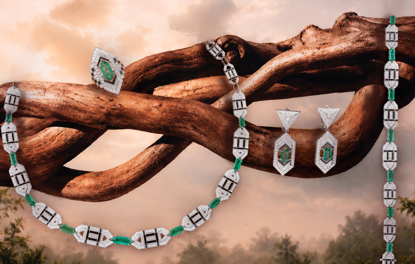
Project hero photograph
Creative internship · Selected project

Nature Inspired
Jewelry Positioning.

Industry Project: An exploration of art direction, product photography,
visual storytelling and digital design for a contemporary fine jewellery brand.

BRIEF:
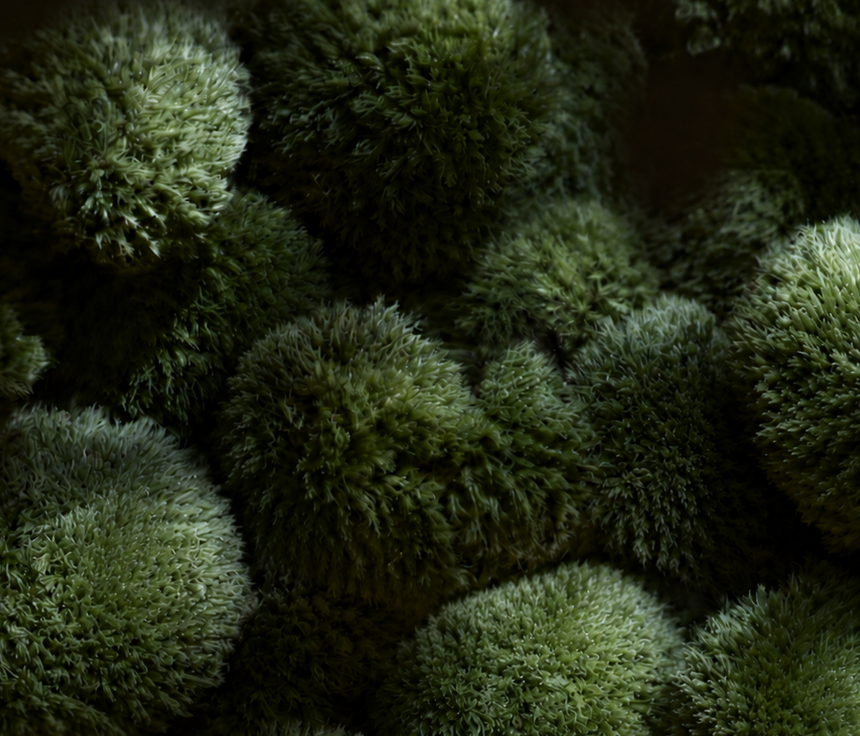
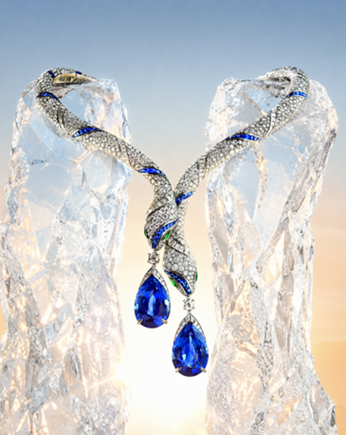
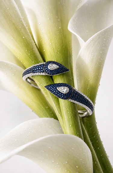
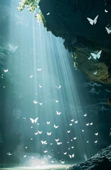
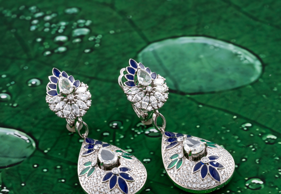
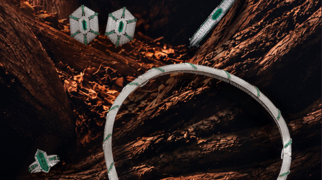
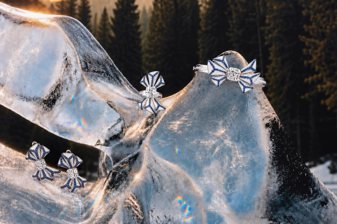
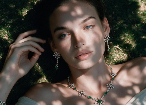
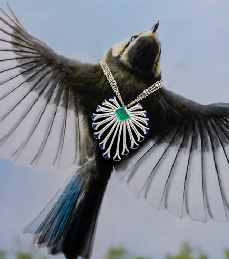
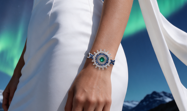
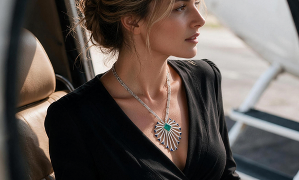
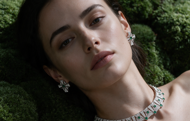
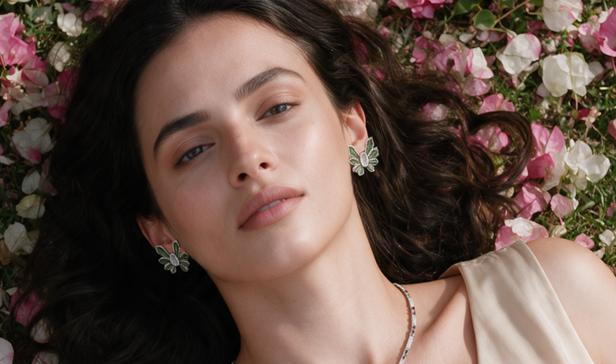
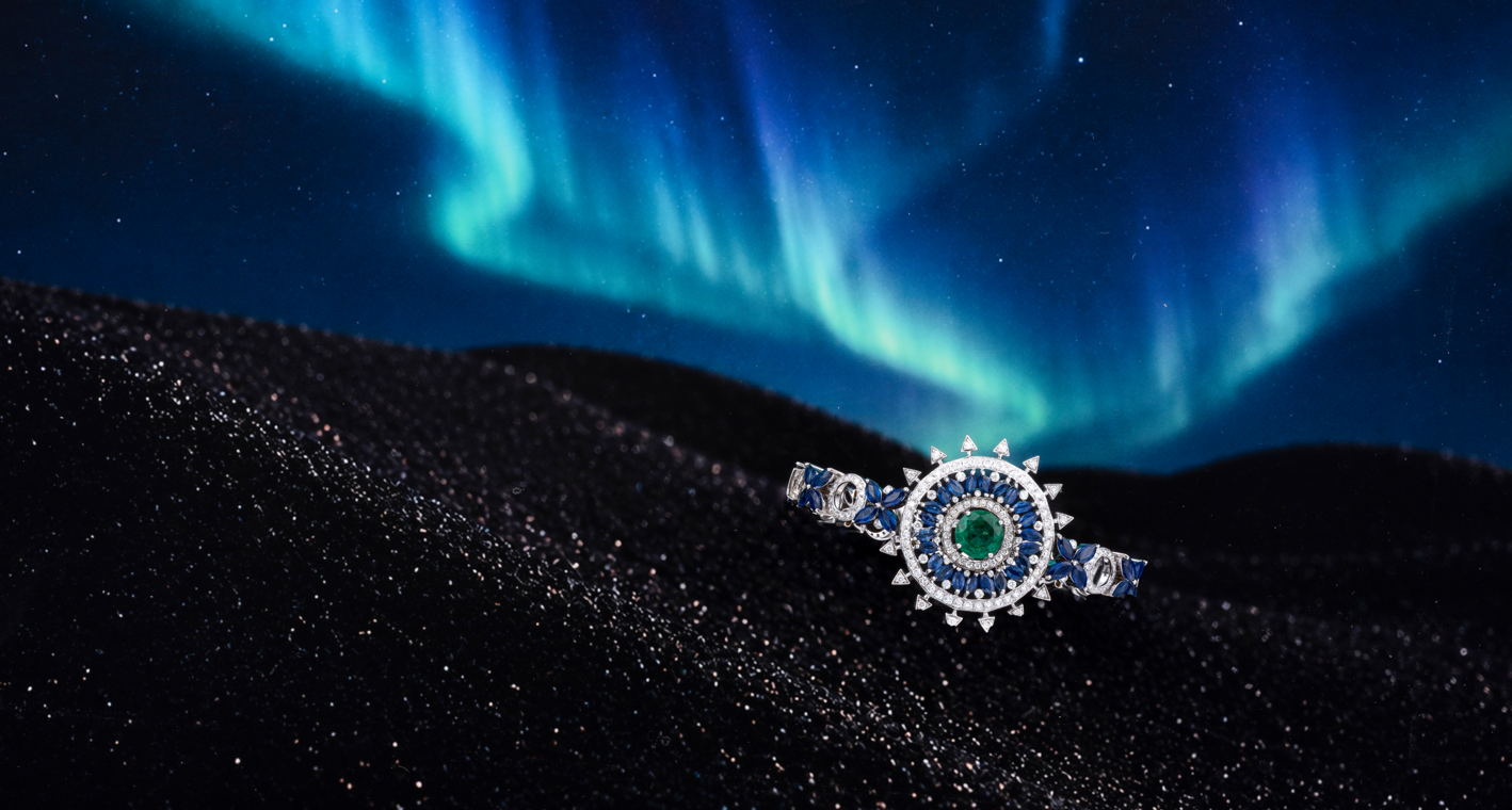
To develop cohesive visual content for MEIR’s fine jewellery collections, aligning product photography, creative direction, and digital presentation with the brand’s nature oriented vision.

Duration
MAY '26 — AUGUST '26
My roles
Creative Direction
Director of Photography
Image Retouching
AI Image Generation
Website Design

Moodboards
& inspirations.

Brainstorming on how their diamond jewelry could be represented
keeping in mind their nine seperate collections.
01 — The vision
Fashion and material inspiration
Art materials and visual research
Landscape inspiration
Interior and texture reference
Creative workspace reference
Editorial portrait inspiration
Notebook and process reference
Abstract art inspiration
02 — THE CREATIVE CHALLENGE

How do you turn an imagined visual into a tangible product experience when it comes to jewelry?

Research notes and creative exploration
Research, references and early observations
03 — Exploration

Finding a visual direction.

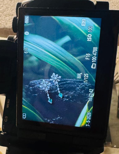
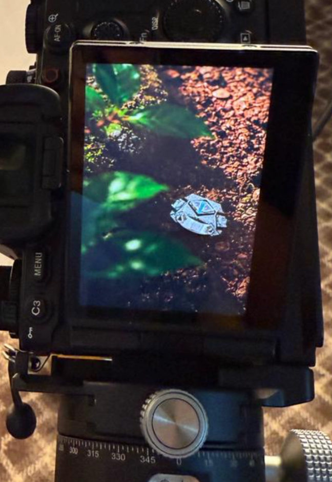
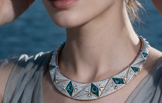
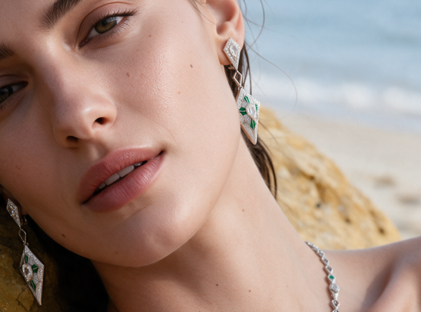
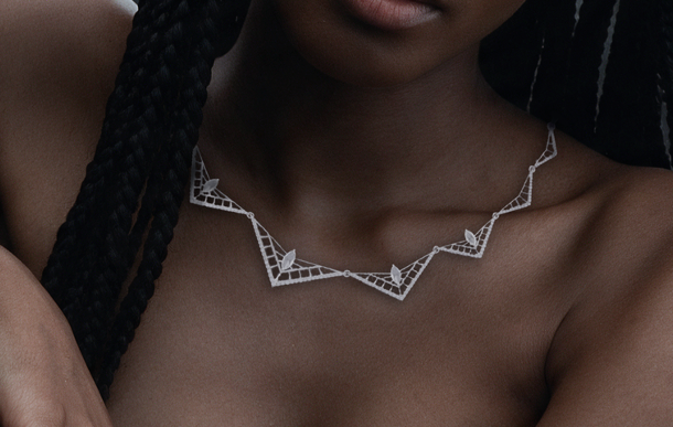
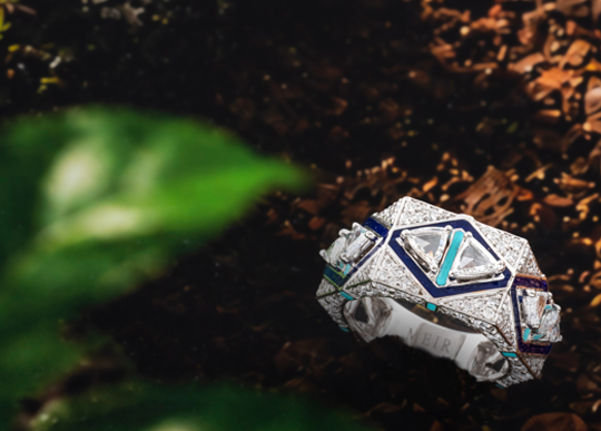
Working alongside the photographer, I helped translate visual references into practical camera setups, experimenting with lighting, angles and composition to capture the intended look of each jewellery piece.

From reference to reality

Making the camera click what we want.

I collaborated with the photographer to communicate the creative vision, fine-tune compositions and ensure the jewellery remained the focal point. This process bridged imagined visuals with real photography while maintaining the brand’s aesthetic.

Design objects and composition
Testing composition, materials and visual balance

Editing mein
sambhal lenge.

04 — The process
01 / 05

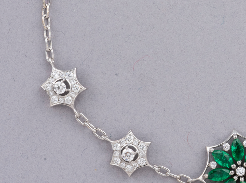
Background Cleaning

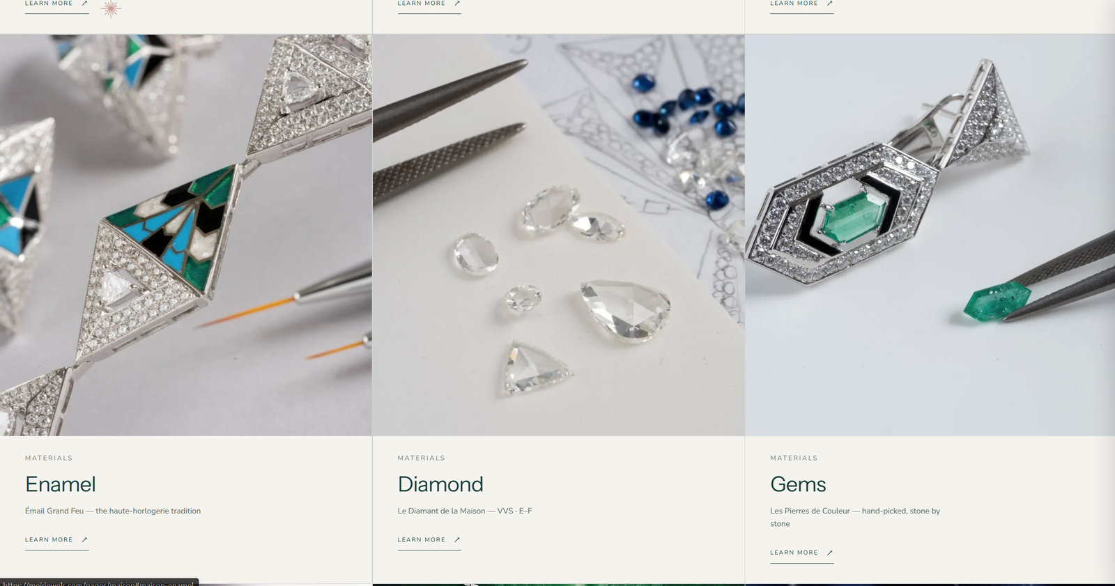
Removed uneven backgrounds and refined the grey backdrop for a clean, consistent product presentation.
Research notes
02 / 05

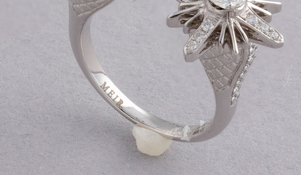
Wax Removal

Eliminated visible wax used to hold jewellery in place during photography.
Concept development
03 / 05

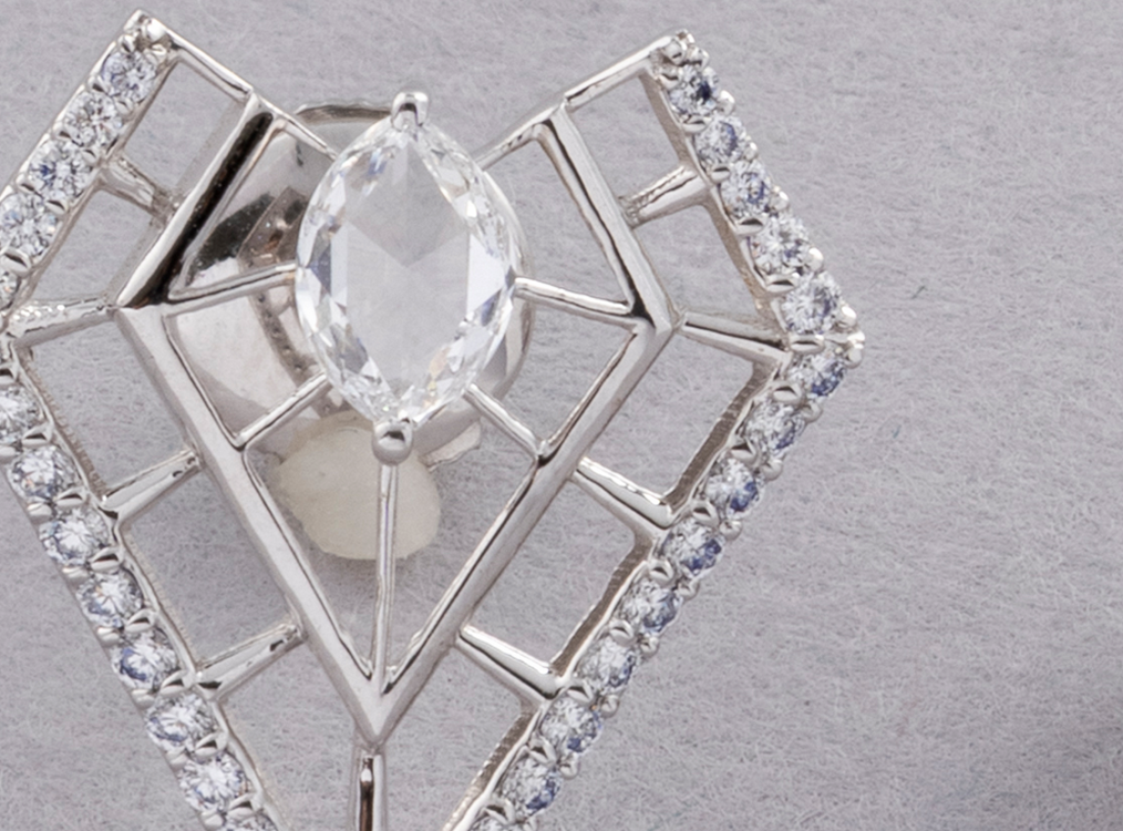
Reflection & Flaw Removal

Corrected camera reflections and imperfections while preserving the jewellery’s details.
Visual experiments
04 / 05

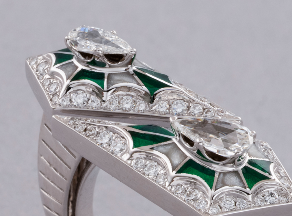
Gemstone Enhancement

Refined the appearance of gemstones, diamonds and enamel to improve colour accuracy and clarity.
Design refinement
05 / 05

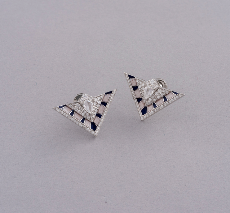
Website Resizing

Adapted the final images into square (1:1) and portrait (2:3) formats for website use.
Final project presentation

The final
outcome.

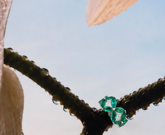
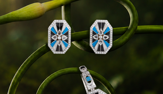
A closer look at the finished work.
Abstract final artwork one
01 — Colour and form
Final design application two
02 — Design application
Final campaign image three
03 — Campaign imagery
Final artwork four
04 — Final artwork
Additional final design one
05 — Material and detail
Additional final design two
06 — Editorial direction
Additional final design three
07 — In context
Additional final design four
08 — Creative details

Designed for
the screen.

05 — Website design
Desktop website design mockup
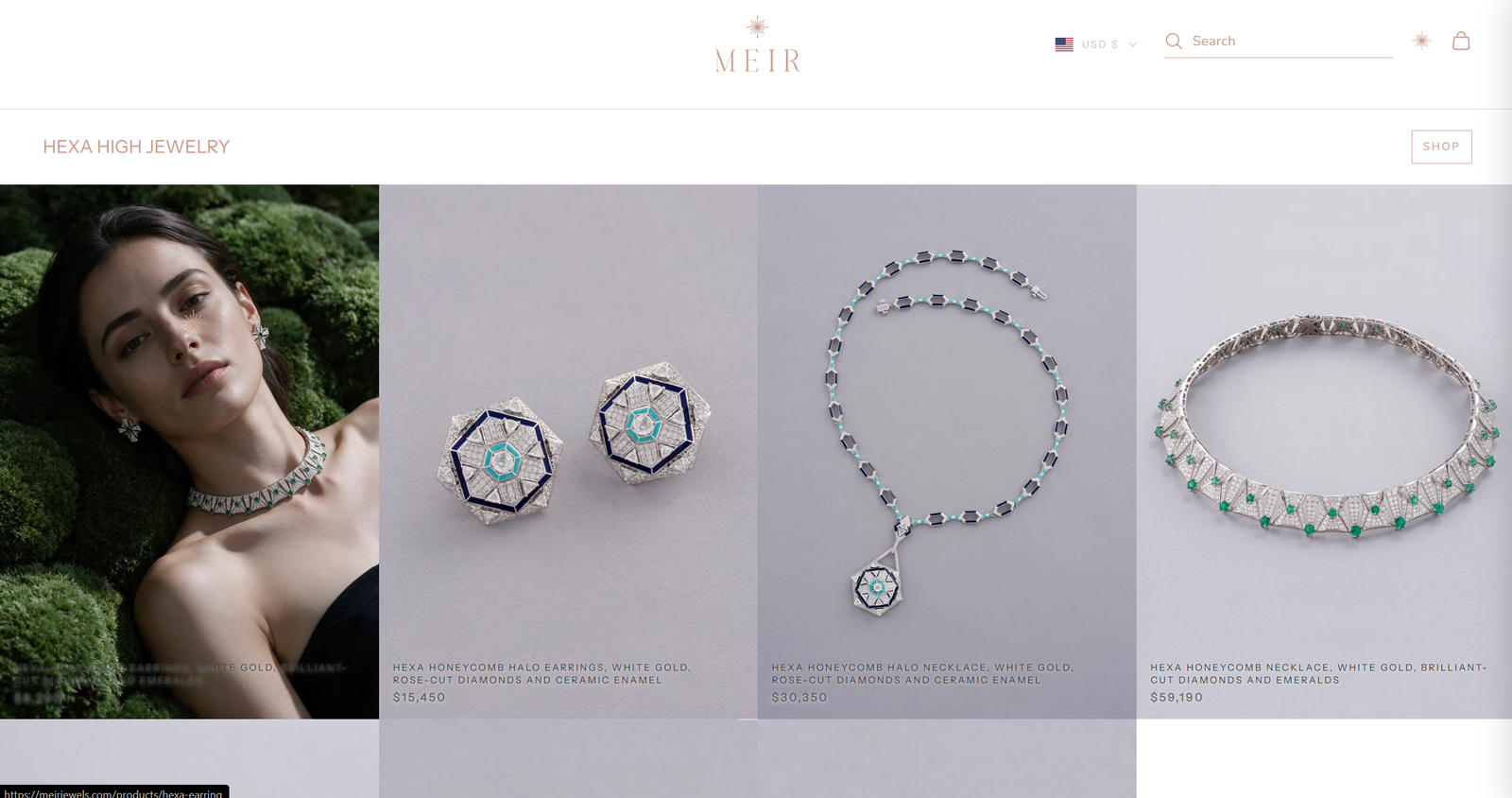
Desktop experience — e commerce/ key screen
Website interface detail
Interface details
Digital design layout
Visual system and layout

For the digital shopping experience.

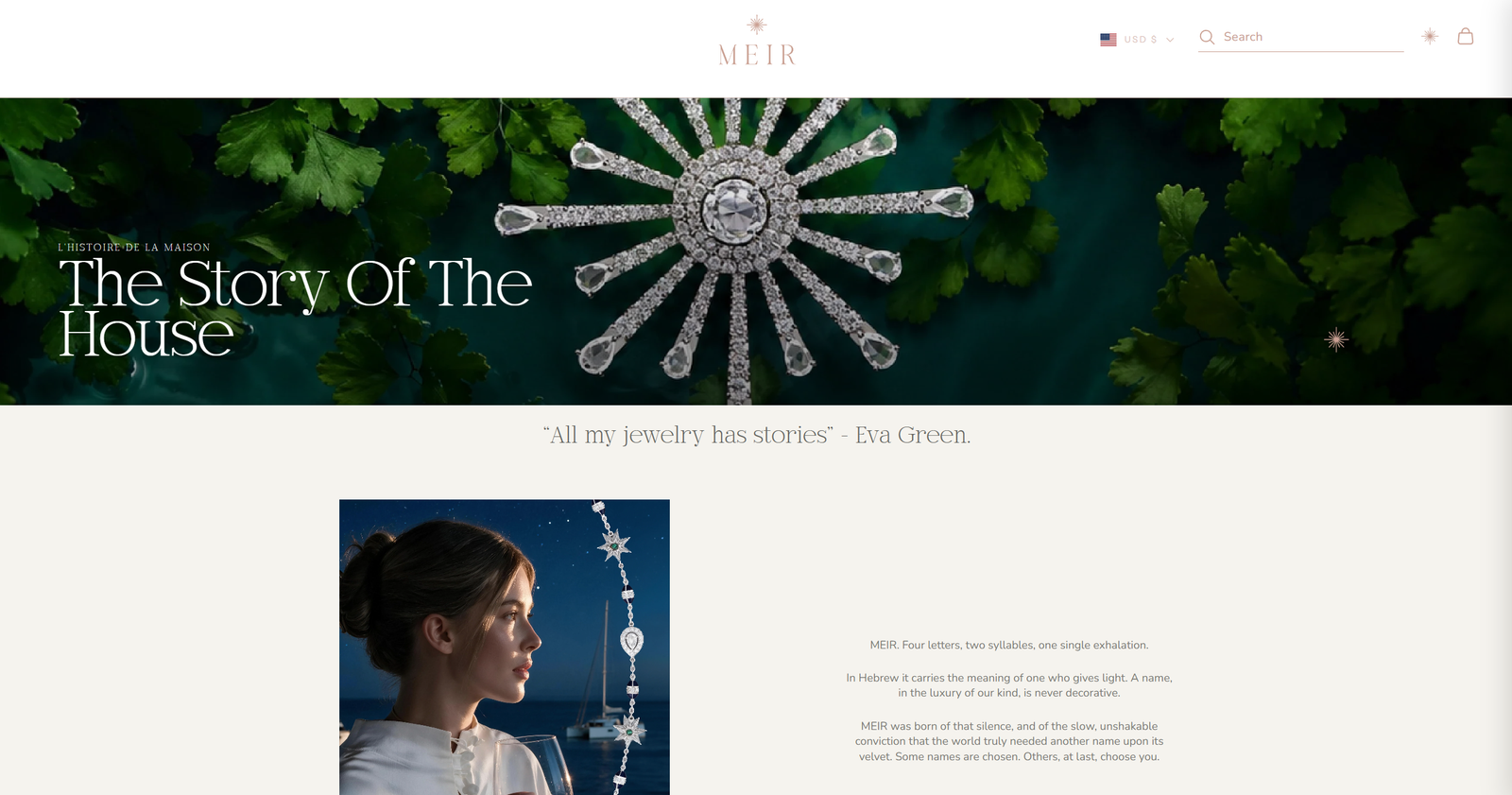
The website project brought together visual identity, product presentation and e-commerce requirements as MEIR prepared to expand into the US market.Working with Shopify and the Prestige theme helped me understand how creative direction translates into a functional online store, where visual consistency must work alongside navigation, product discovery and usability.
End of project / Thanks for scrolling

More work.
More stories.

© 2026 Poorvi Toshniwal Back to top ↑ Designed with intent