Project Case Study — Brief & Process
POORVI TOSHNIWAL / PORTFOLIO Selected work · 02 / 04
Project hero photograph
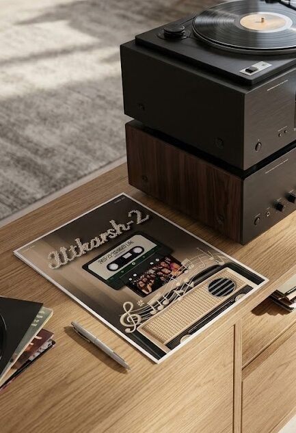
Editorial Design · Publication Series

Newsletters for
Utkarsh-2.

Industry Project: A monthly newsletter to cherish the last decade of the
woman's togetherness of Utkarsh's chapter 2 organistaion.

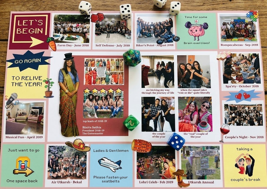
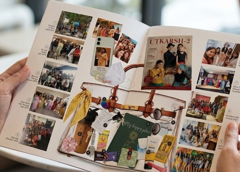
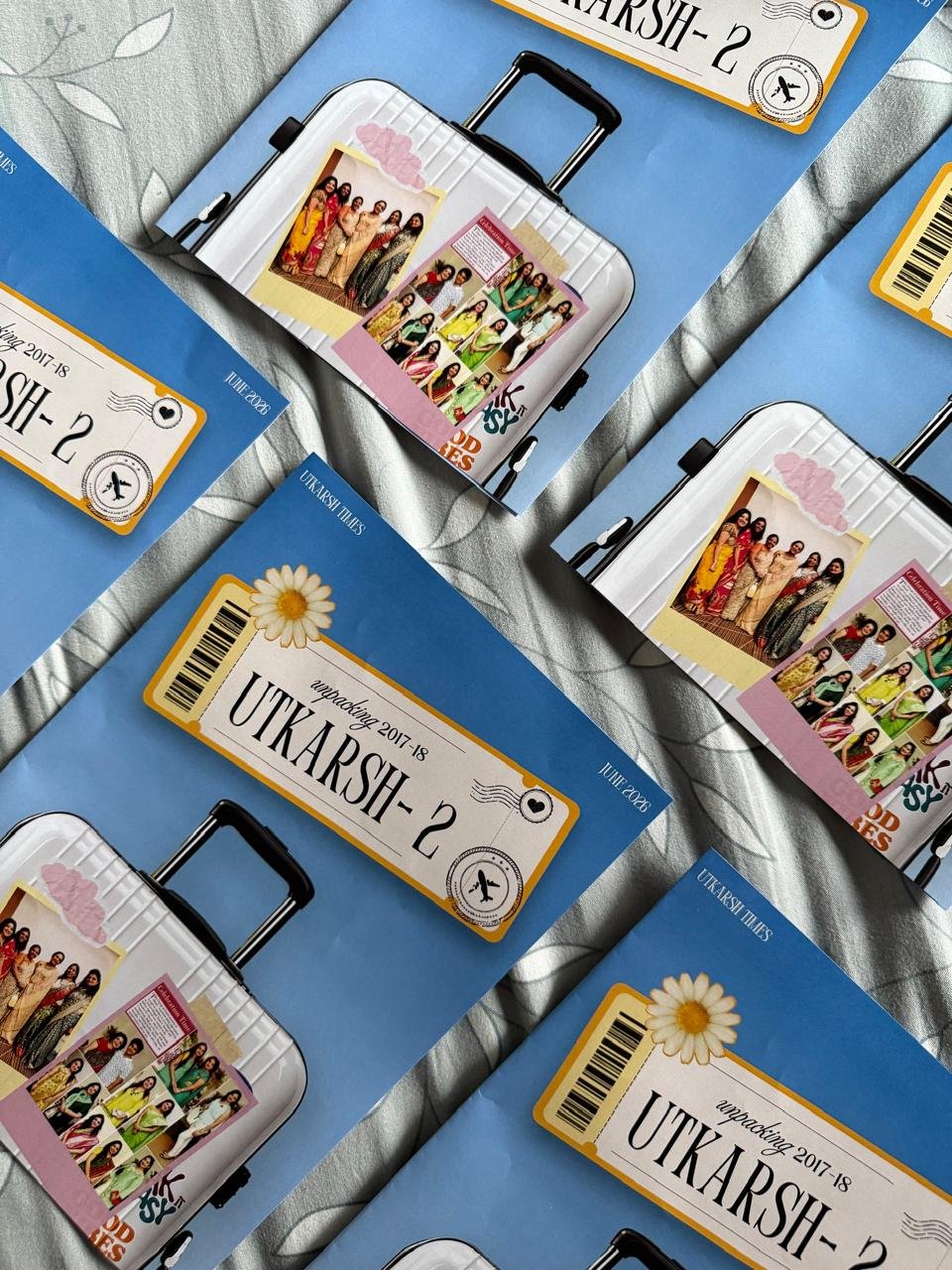
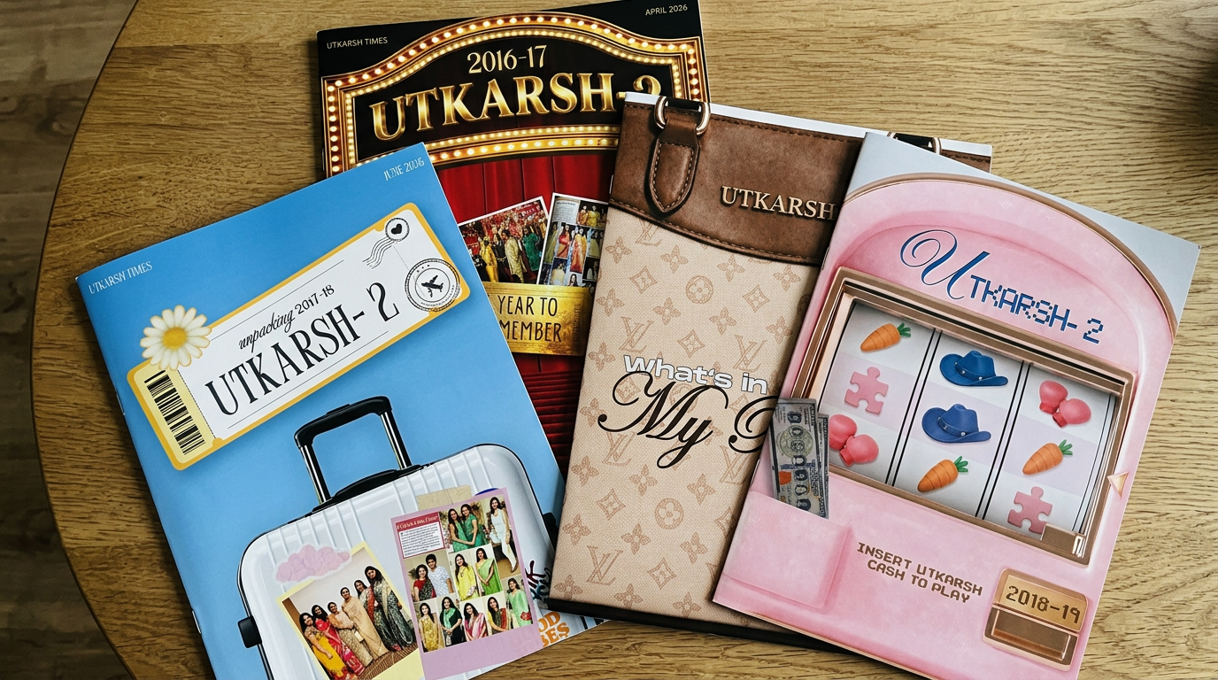
A monhtly publication reimagined through distinct visual worlds, bringing together storytelling, graphic design and the spirit of a community.

Duration
APRIL '26 — ONGOING
Company
UTKARSH, HYDERABAD
My roles
Concept Development
Art direction
Graphic Design

The brief.

01 — Context & objectives
Notes and research
Creative exploration
Art and visual reference

Ten Years. Ten Months. One publication each

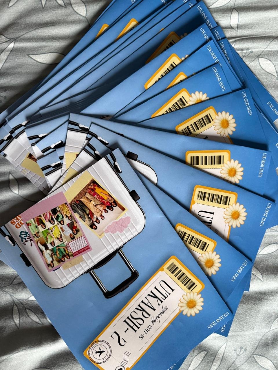
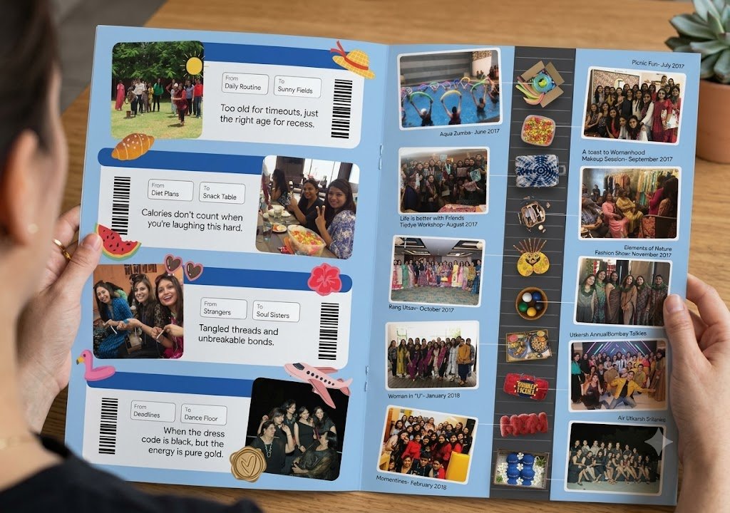
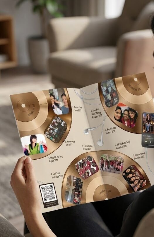
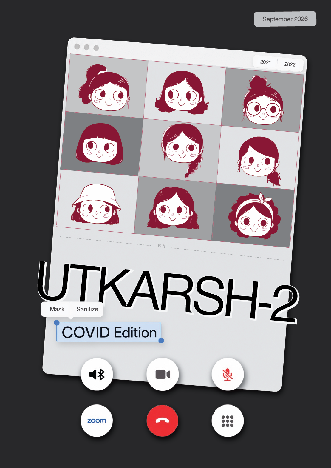
Utkarsh-2 is an all women, women-led club that favour social and cultural experiences. This publication documents a year of events, experiences and shared memories in every month's edition. The challenge was to give every edition a distinct identity while retaining its connection to the larger publication series.

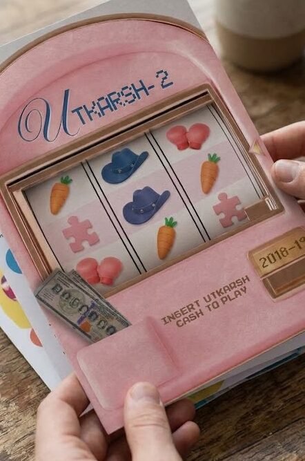
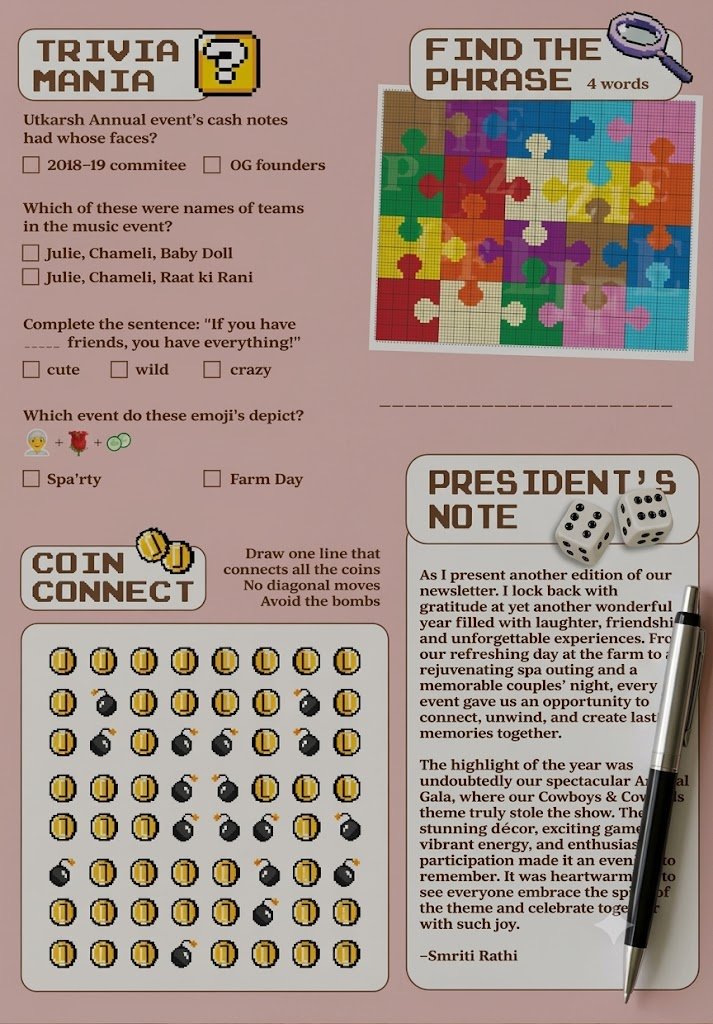
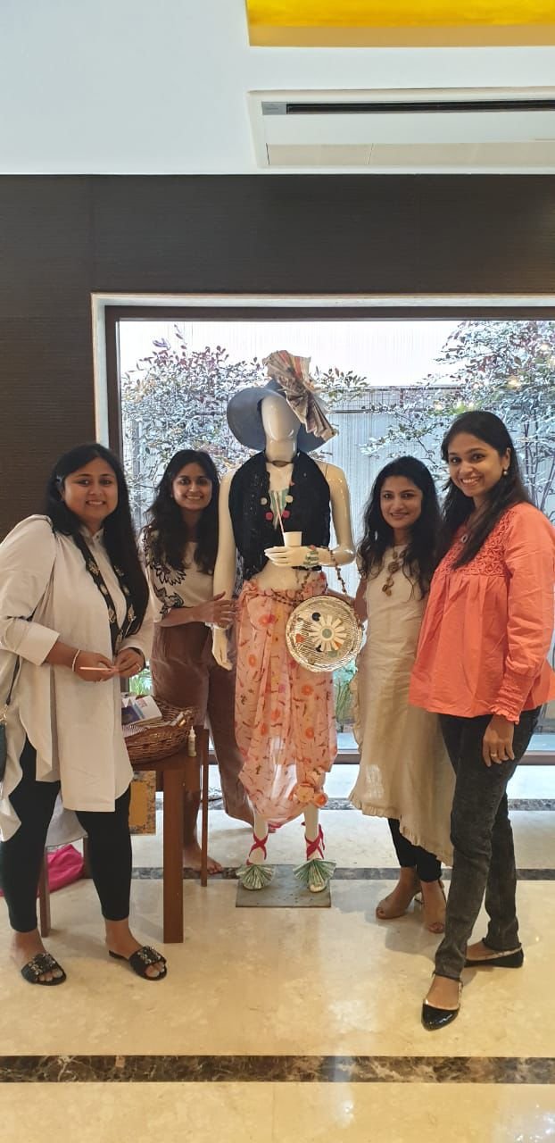
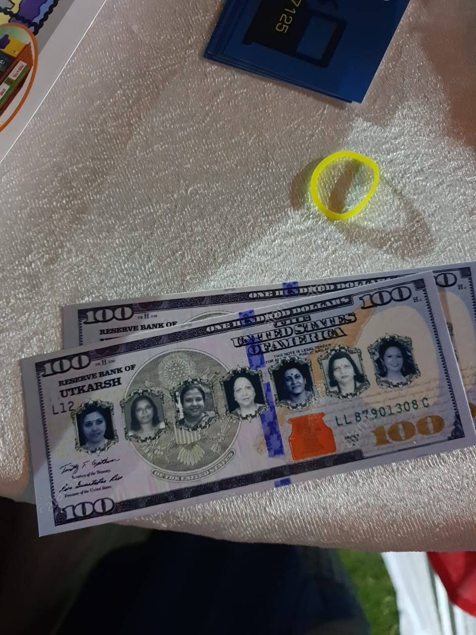
From cinematic storytelling and travel-inspired layouts to arcade games, fashion accessories and music, each edition transformed familiar moments into an engaging visual narrative.The objective was to make the publication more than something to read, an experience to explore, interact with and revisit.

02 — The final outcome

Utkarsh Editions

Every year began with a different idea. The concept shaped the cover, colour palette, typography, illustrations, image treatments and interactive elements, creating a visual language that carried through the entire publication. The following editions explore how one recurring format became five distinct design experiences

The year takes centre stage.

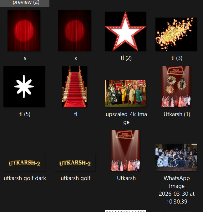
Inspired by the magic of Bollywood and the visual language of cinema, this edition transformed the year's memories into a blockbuster experience. Film strips, red-carpet imagery, star-studded compositions and movie-inspired references brought the newsletter to life. Events were presented like scenes from a film, while playful trivia and interactive games added another layer of engagement. The design celebrated the people and moments that made the year memorable, turning an annual recap into a cinematic journey.
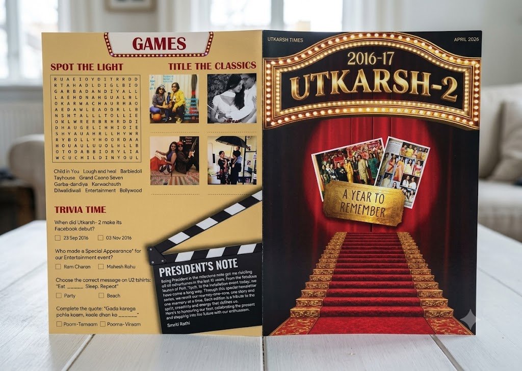
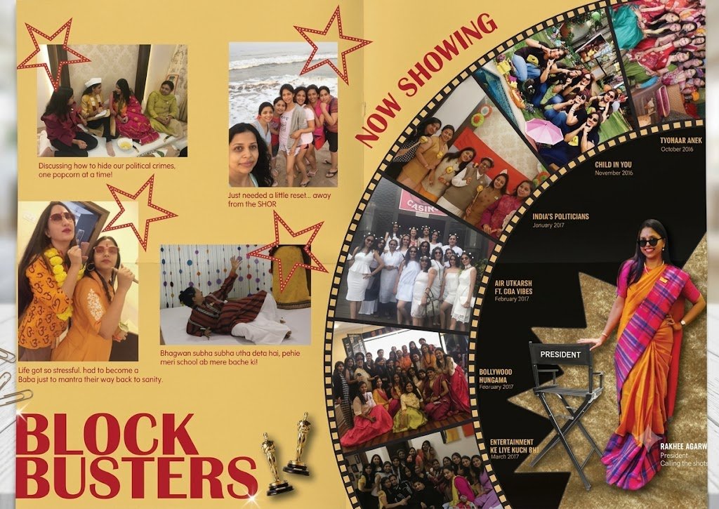
The opening creditsBehind the scenesStar moments
03 — THE DESIGN APPROACH

Concepts turn into composition.

Each edition began with a central theme that informed the visual direction. The challenge was to translate that idea into a cohesive publication without losing the relatability and recall value of the events that people of the club have.

Step 01 / 07

Conceptualisation

Identifying a theme that could connect the year's activities and shape the publication's overall identity.

Discover stage notes
Listening, observing and defining the challenge
Step 02 / 07

Visual research

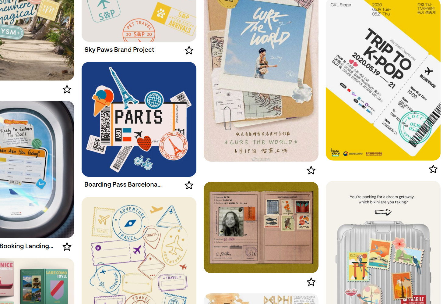
Exploring references, visual metaphors, colour palettes, typography and graphic elements suited to the chosen concept.

Investigation and reference imagery
Step 03 / 07

Layout development

Creating a structure that balanced editorial content, event photography, illustrations and interactive sections.

Defining the creative direction
Step 04 / 07

Design execution

Developing covers and inside spreads, maintaining consistency while giving each section its own character.

Exploration stage
Step 05 / 07

Refinement and production

Bringing the layouts together into a finished publication, refining the visual details and preparing the print-ready files.

Developing the visual system
Step 06 / 07

Recall Value

The magazine has to be relatable and trigger a memory recall for the members. If not then it's too vague or farfetched.

Refinement and iteration
Step 07 / 07

Print & Deliver

Prepare the print files and send them over to my printer. After thorough inspection delivered to client.

Completed project output